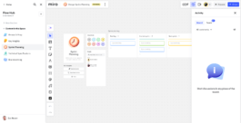
Miro Empty State Icons
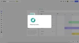
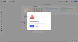
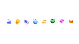
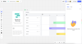
I worked with Miro's product team to create a set of product UI icons communicating empty states.
Each icon applies Miro's updated colour system. The dimensional approach creates natural hierarchy and focus points while maintaining accessibility standards. Colours work in harmony with depth cues to strengthen visual communication without relying solely on color differentiation.
The icons align with the core philosophy behind Miro's design system - creating meaningful moments that guide, inform, and delight Miro users while strengthening the overall coherence of the platform's visual language.


